home
resume
contact
university of manitoba
Role
Duration
Industry
Lead UX/UI Designer
6 Months
Non-Profit / Higher Education
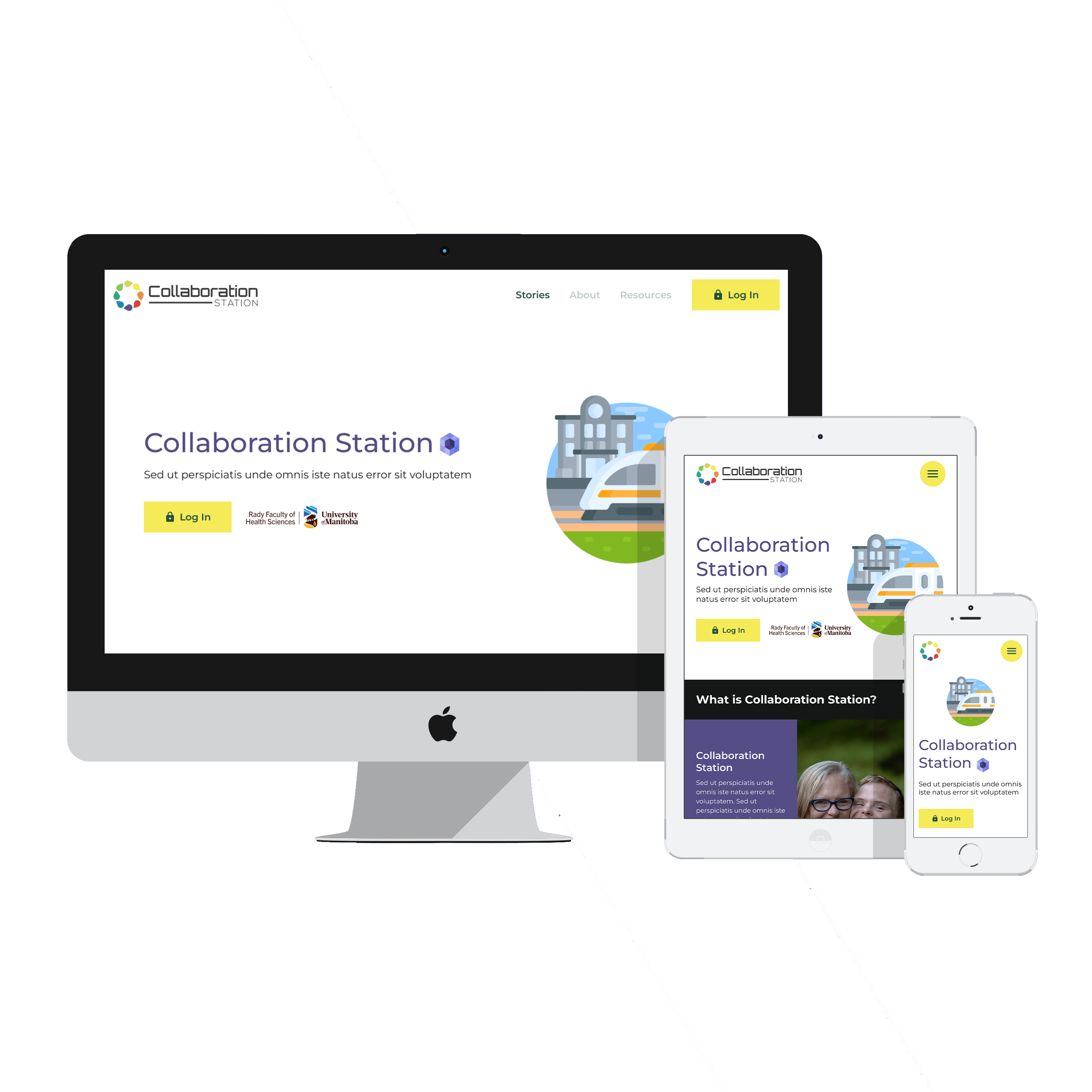
Designed a community platform for families living with disabilities, balancing playful, accessible design with a phased build strategy that kept the project on scope and on budget.
Background
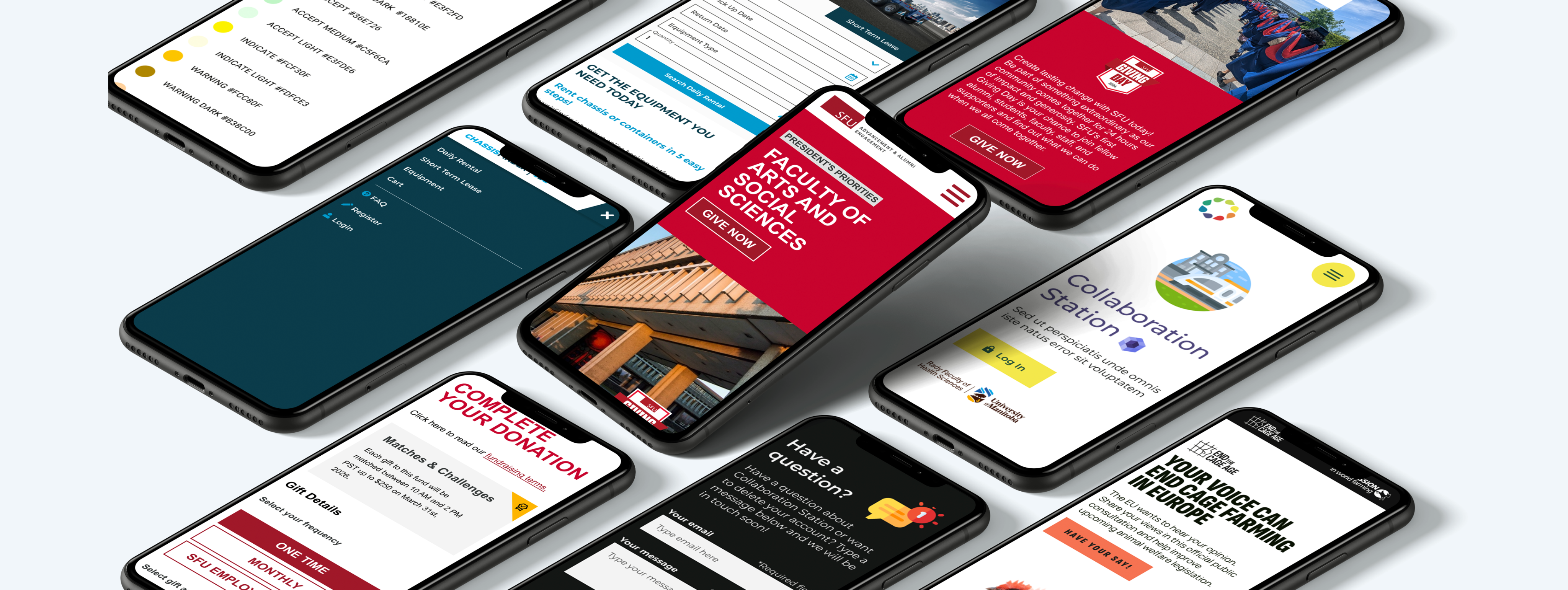
I was brought in to help research and design a new online community space for the University of Manitoba's Rady Faculty. The platform — called Collaboration Station — was built to connect families and individuals living with disabilities with researchers, healthcare providers, and university partners. To get the full picture, I started with a series of conversations with project lead Sarah, learning the history behind the initiative, the relationships involved, and the long term outcomes the team was working toward. From there we got to work.
UX RESEARCH & PRODUCT VISIONING
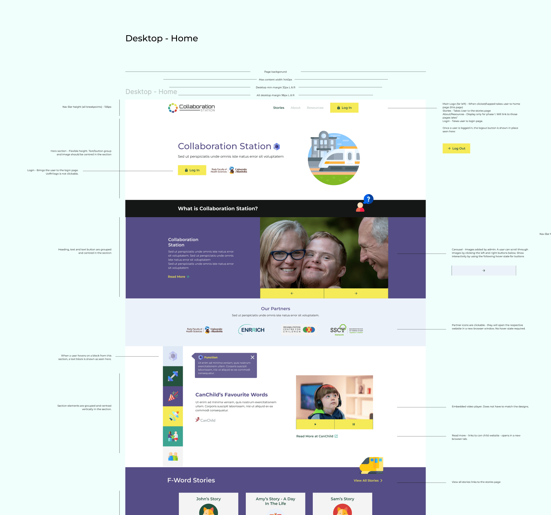
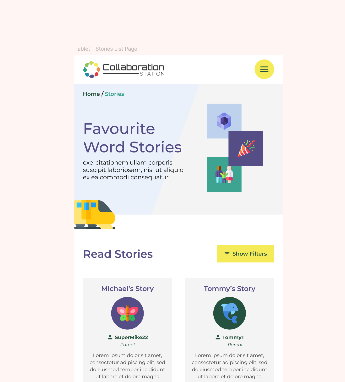
Using our recorded conversations, existing survey data from Sarah's team, and some comparative research, I mapped out high level site goals, user personas, and a feature list. Given the project's resourcing constraints, I recommended a phased approach, building the most critical components first and leaving room to expand over time. From there I developed sitemaps, user flows, and wireframes for the initial phase, iterating through several rounds of feedback until we had a clear direction everyone was confident in.
In parallel, conversations with the engineering team pointed us toward a CMS-based build rather than starting from scratch. WordPress made the most sense for a team that needed to manage the site administratively without ongoing developer support. As with most projects, keeping that developer conversation going throughout was key to staying on scope and on budget without compromising the vision.
IMPACT
- Delivered a phased build strategy that prioritized essential features first, keeping the project on scope and within budget
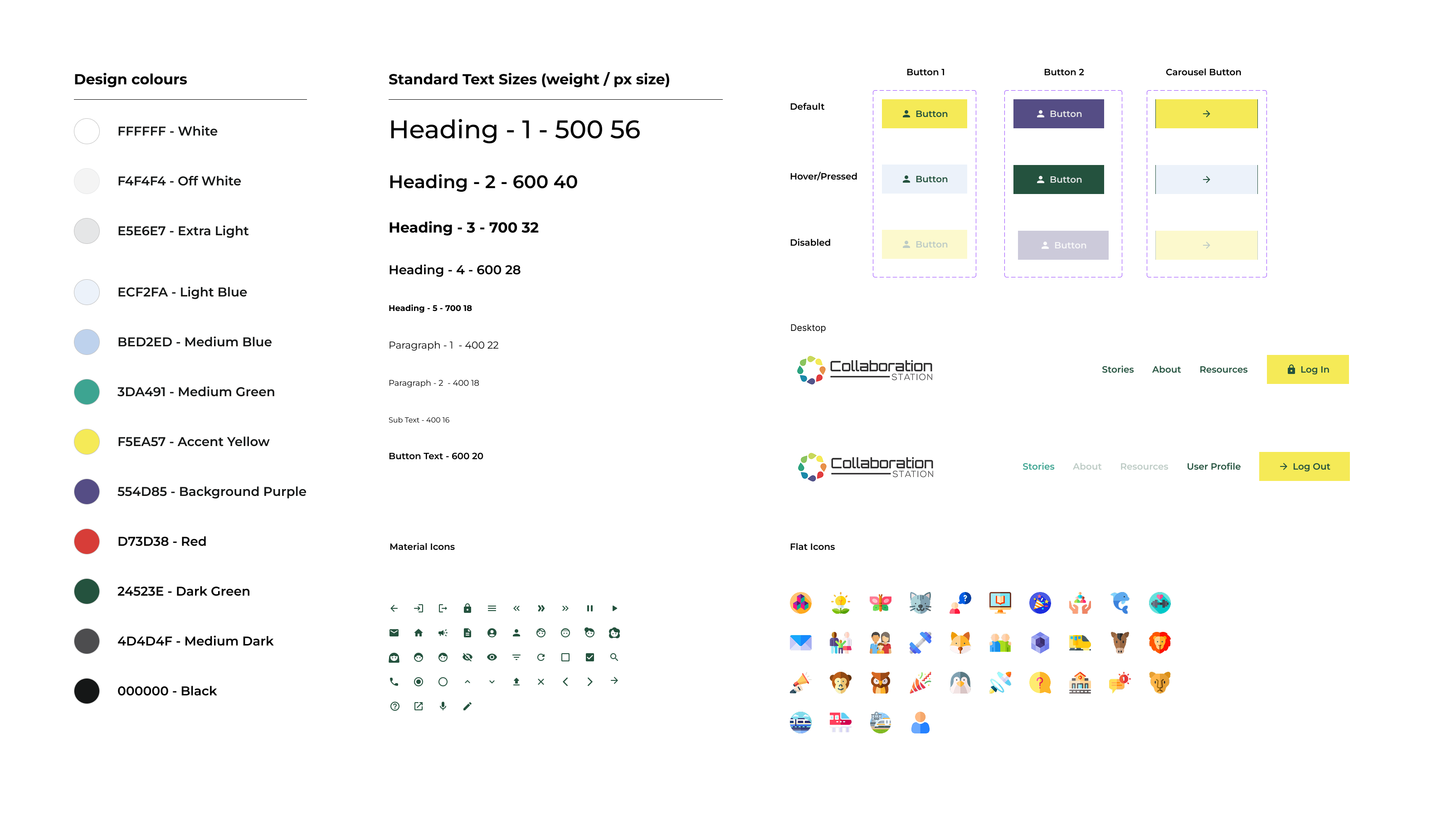
- Created a playful, accessible design system aligned with WCAG standards, built for a primary audience of youth and families living with disabilities
- Colour contrast, legibility, and tap target sizing were validated across devices to ensure the site worked for all users
- Component library and style guide built in Figma allowed for easy updates and changes down the road
- Chose WordPress as the CMS to support the team's need for administrative flexibility without a custom build

Let’s work
Contact

home
work
resume
contact
university of manitoba
Role
Duration
Industry
Lead UX/UI Designer
6 Months
Non-Profit / Higher Education
Designed a community platform for families living with disabilities, balancing playful, accessible design with a phased build strategy that kept the project on scope and on budget.
Background
I was brought in to help research and design a new online community space for the University of Manitoba's Rady Faculty. The platform — called Collaboration Station — was built to connect families and individuals living with disabilities with researchers, healthcare providers, and university partners. To get the full picture, I started with a series of conversations with project lead Sarah, learning the history behind the initiative, the relationships involved, and the long term outcomes the team was working toward. From there we got to work.
UX RESEARCH & PRODUCT VISIONING
Using our recorded conversations, existing survey data from Sarah's team, and some comparative research, I mapped out high level site goals, user personas, and a feature list. Given the project's resourcing constraints, I recommended a phased approach, building the most critical components first and leaving room to expand over time. From there I developed sitemaps, user flows, and wireframes for the initial phase, iterating through several rounds of feedback until we had a clear direction everyone was confident in.
In parallel, conversations with the engineering team pointed us toward a CMS-based build rather than starting from scratch. WordPress made the most sense for a team that needed to manage the site administratively without ongoing developer support. As with most projects, keeping that developer conversation going throughout was key to staying on scope and on budget without compromising the vision.
IMPACT
- Delivered a phased build strategy that prioritized essential features first, keeping the project on scope and within budget
- Created a playful, accessible design system aligned with WCAG standards, built for a primary audience of youth and families living with disabilities
- Colour contrast, legibility, and tap target sizing were validated across devices to ensure the site worked for all users
- Component library and style guide built in Figma allowed for easy updates and changes down the road
- Chose WordPress as the CMS to support the team's need for administrative flexibility without a custom build
Let’s work
Contact